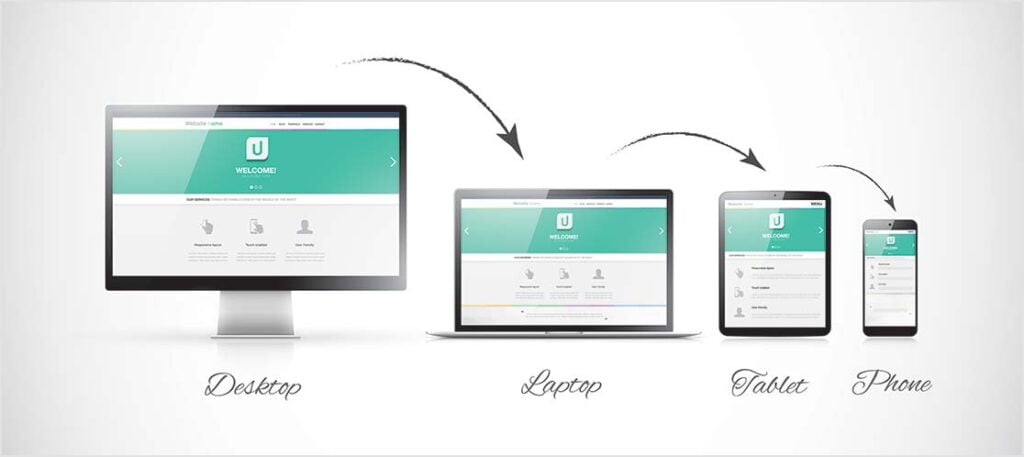
In today’s mobile-centric world, having a responsive website is crucial for providing a seamless user experience across various devices and screen sizes. With WordPress being a popular platform for website development, it’s essential to understand and implement responsive web design principles to ensure your site looks great on desktops, tablets, and smartphones. In this comprehensive guide, we will explore the importance of responsive web design and provide practical tips for achieving a responsive WordPress site that adapts to different devices and delivers an optimal browsing experience.
Why Responsive Web Design Matters:
- Improved User Experience: Responsive design allows your website to adapt and display content appropriately. This ensures easy navigation regardless of the device used.
- Increased Mobile Traffic: Mobile devices account for a significant portion of internet traffic. A responsive website ensures that mobile users can access and interact with your content seamlessly.
- Better SEO Performance: Google and other search engines prioritize responsive websites in their search rankings. A mobile-friendly site leads to higher visibility and improved organic search traffic.
- Cost and Time Efficiency: Building a responsive website eliminates the need for separate mobile and desktop versions, saving development time and reducing maintenance efforts.

Implementing Responsive Web Design in WordPress:
Choose a Responsive Theme: Selecting a responsive WordPress theme is the first step towards building a responsive site. Ensure the theme you choose explicitly mentions responsiveness in its features and has a mobile-first approach.
Use a Responsive Framework: If you prefer custom theme development, consider using a responsive framework like Bootstrap or Foundation. These frameworks provide a grid system and pre-built responsive components, simplifying the process of creating a responsive layout.
Optimize Images: Large images can significantly impact the loading time of your website, especially on mobile devices. Optimize your images by compressing them, using appropriate image file formats, and implementing lazy loading techniques.
Prioritize Mobile-friendly Navigation: Mobile users have limited screen space, so prioritize a clean and concise navigation menu. Utilize a hamburger menu or an expandable menu to accommodate smaller screens.
Implement Responsive Typography: Ensure your text is easily readable on all devices by using responsive typography. Use relative font sizes rather than fixed pixel sizes, allowing text to adjust according to screen dimensions.
Fluid and Flexible Layouts: Design fluid and flexible layouts that adapt to different screen sizes. Use percentage-based widths and maximum-width properties to allow your content to adjust proportionally.
Breakpoints and Media Queries: Set breakpoints and use media queries to apply specific CSS styles based on different screen sizes. This allows you to optimize the layout, typography, and other design elements at various breakpoints.
Test Across Devices: Regularly test your website across multiple devices and screen sizes to ensure consistent responsiveness. Use physical devices, browser developer tools, and online testing tools like Responsinator or BrowserStack to validate your site’s responsiveness.
Consider Mobile-first Development: Adopt a mobile-first development approach, where you design and optimize your website for mobile devices first before adapting it to larger screens. This ensures that your site’s core functionality and essential content are readily accessible on mobile devices.
Leverage Responsive Plugins: WordPress offers a wide range of responsive plugins that can assist in achieving responsiveness. Plugins like WPtouch and Jetpack’s Mobile Theme provide mobile-specific features and optimizations.
Conclusion:
Responsive web design is no longer an option but a necessity in today’s digital landscape. With the increasing dominance of mobile devices, ensuring your WordPress site looks great and functions flawlessly across all screen sizes is essential. By following the tips outlined in this comprehensive guide, you can implement responsive web design principles in WordPress effectively. Prioritize user experience, use responsive frameworks, and test across devices to create a website that delivers a consistent and seamless browsing experience. Embrace the power of responsive web design to reach a broader audience and provide an exceptional user experience across all devices.

Leave a Reply